We have moved!

AIGA NH/VT has moved our Blog to http://www.aiganhvt.org. In addition to getting our own domain name we have upgraded from the free WordPress.com Blog to a WordPress.org server. We are very excited about the new features and possibilities made possible by this upgrade. Please update your bookmarks with the new URL and visit us often!
-Mark
Fresh Squeezed? – Arnell Talks
As an add on to the last post… here’s Peter Arnell Explaining Failed Tropicana Package Design… I fell asleep at 1:38, then woke up, and started rolling my eyes at 2:26.
Fresh Squeezed

Tropicana's fresh branding
This week Pepsico announced it was reverting to the old Tropicana packaging design after the re-design “created confusion in the grocery aisle and put off loyal customers.” The re-design was done by Peter Arnell, the same designer who created the new Pepsi logo and packaging.
Have you seen the re-designed Tropicana packaging? What did you think? Are they giving up on the design too soon?
Leave your comments here.
Article Review: How Must AIGA Adapt for the Future?
 I just read a fantastic article on the AIGA Website titled “How Must AIGA Adapt for the Future?” by Richard Grefe. The timing for this article could not be better since the turn in the economy has many of us wondering the same thing. In addition to that, it’s a good thought process to do every so often, especially in times of economic and social change.
Many of the strategic choices listed deal with choosing between immediate and tangible benefits for your membership fee or “raising respect for the value of design” and other less tangible benefits. Personally I would lean towards more tangible benefits, especially when you have to justify the expense to your employer or you are trying to cut your own bills.
One of the strategic choice that caught my interest is
“Publishing an annual featuring works from AIGA’s juried competitions ORshifting away from the competitions toward establishing a member gallery and a weekly on-line publication, with commentary on selections by guest curators.”
I like the idea of a member gallery, weekly on-line publication and commentary from curators better than competitions. I would not mind if they put less resources into printing and mailing me stuff and more into on-line content and other resources I can use to be a better designer.
The comments by readers are worth reading becuase some good observations and suggestions are made. I noticed the very first one suggested a lower price for the membership. That would sure make the choice to renew your membership easier, especially if you pay for it yourself. Other comments addressed the Website content and ways to add value to the membership experience.
What do you think about these choices and direction for the future?
Digital Arts and Humanities Lecture Series at Dartmouth
Those in the upper valley design community may be interested in some of the topics in the Digital Arts and Humanities Lecture Series at Dartmouth. Dartmouth is bringing humanists, technologists, and artists to campus who focus on the interplay of digital technology, culture, games, art, and science.
The next lecture in the series is tonight, Tuesday February 3, 2009 at 4:30pm
“Communities of Play: Emergent Cultures in Multiplayer Games and Virtual Worlds”
Celia Pearce, Director of the Experimental Game Lab at Georgia Tech
Dartmouth Campus, Silsby 028
Visit the website for more information on upcoming lectures in the series.
Understanding DPI
DPI is a seemingly simple concept, but there is widespread misconception on what it actually is, and where and how it matters. This is an old topic, but people keep getting it wrong. It’s never bad to revisit things like this and extend our understanding.
DPI vs. PPI
Designers know that DPI (Dots Per Inch) is a measure of how many ink dots a printer is capable of placing along a one inch line. Many designers incorrectly believe that DPI is also a measure of how many image pixels will be placed along a one inch line. There’s a separate term for this: PPI (Pixels Per Inch). Pixels per inch is also used in scanning, where a physical item is converted into a pixel grid.
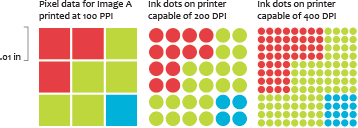
This is a real easy one to remember: If it’s an output device like a printer, the correct term is DPI. If it’s digital media where pixels are used, (like a digital photo or scan,) it’s PPI.
The confusion is widespread. Many stock photo sites sell images at various DPI values. As of this writing, even Wikipedia discusses digital images in the DPI section. But, take a look a Photoshop’s “Image Size” window. It clearly states “Pixels/Inch” under “Resolution”.
PPI doesn’t matter on the web
Try this: Create a new photoshop document at 300x300px, and set the resolution to 100 PPI. Now, create a second image at 300x300px, this time set the resolution to 200 PPI. Fill both with a solid color. View both on your computer at 100%. They’re the same size on screen: They each use 300×300 pixels on the screen. Now, print both from photoshop at 100%. You’ll notice that on paper, their size differs considerably.
![]()
When an image is displayed on the web, it is done so as if it were being viewed at 100%. The PPI value only applies when an image is being printed.
PPI is not a measure of image quality
If you saved the images from the example above and looked at their file sizes, they would be identical. A lower PPI value does not necessarily have less information. The only measure of how much digital information is contained in an image is the number of pixels.
![]()
A smaller image at a higher PPI value may contain less information than a larger image at a lower PPI value. It’s easy to figure out which image has more information: multiply the dimensions by the PPI value, and compare the pixel count.
Photoshop allows you to change the PPI value without touching the pixel information. To do this, uncheck “Resample Image” in the “Image Size” dialog. Any changes you make in this way will affect neither how large your image is displayed on screen, nor how large your image is displayed on the web, nor the size of the file when you save it. The only thing you are changing is how large it will print. Any image can be adjusted to print at any size or resolution without changing the pixel data.
PPI cannot exist alone
Since the PPI value can be changed without changing any pixel data, it’s not possible to know how much information is contained in an image if all you have is a PPI value.
![]()
Occasionally, stock agencies will sell different image sizes by offering the images at various “DPI” dimensions. There’s very critical information missing here. When the agency does not provide pixel dimensions (or physical dimensions) in addition to PPI, then it’s possible that the agency can sell you the exact same pixel data for all of these image sizes. Most importantly, you have no idea how large and at what quality you are actually able to use the image until after you’ve bought it.
When a client sends you an image, remember: you can always change the PPI value if it’s wrong, but if you don’t have enough pixel data, you’re out of luck.
-Michael Niggel
New Free Font for you! Rovetti Print…

Man, I can't stop with the free stuff!
Yeah, here it is in all of it’s glory… my first foray into the world of type! Criticisms and all the rest are welcome… so go and download it… it over here at:
http://rovettidesign.com/2009/01/rovetti-print-a-new-free-font-for-you/
Let me know what you think, and whether you use it in anything cool? Want a cool tool? Want to know how to make them? Ask me, and I’ll blog about it (that is, if I have any idea how to do it). Anything from making custom brushes, displacement maps, custom gradients, styles, actions… you name it. I’m ready for questions! Just contact me here, or at http://www.rovettidesign.com. Ok, that’s it from your rusty, trusty, and loving web chair for now. Now go get that font and do something with it!! Boo yaah!
Photoshop World Boston | March 25-27

Oh yeah… it’s coming soon. Is anyone registering and making the trek? With the classes and panel of instructors, it’s money well spent. Has anyone been to a Photoshop World before? Sound off… is it valuable, does it look cool, are you afraid of crowds of Photoshop freaks with laptops?
Here’s a snippet from the frontpage of http://www.photoshopworld.com of some of the super-talented instructors.

Pepsi, WalMart and Best Buy logos: Better or Worse?
In 2028, graphic design students will look back at 2008, and what will they conclude about the state of design? Based on the new logos Pepsi, Walmart and Best Buy released this year, maybe that the design world embraced a ban on All Caps, or that blue and yellow were the colors of the year, or that serifs were horribly out of vogue. I’ll be interested to hear everyones thoughts on the following logos. Here are mine:
![]()
I’m guessing the designers who worked on the new Walmart logo spent some time studying the Target logo, who would blame them. I’m happy they lost the star from the center of the word, but the yellow burst at the end lacks energy. If you could find a few people who don’t know what Walmart isand asked them to figure out what Walmart is from this logo, I think energy company, light bulb makers, or even idea generators would be higher up on the list than big box discount store. Read more and see an evolution of the logo here.
![]()
When I first saw this logo, I thought, “Geez, this looks a lot like the new Walmart logo”. The old logo does look out of date, but the new logo is bland. I’d love to see the other options they didn’t choose, I’m guessing the nice way the line of the price tag parallels the stroke of the y was not the only interesting element the designers came up with. I have yet to see this in our local store but there is nothing subtle about the giant yellow price tag and I’m not so sure the new version will have any stand out power at all. Read more about the logo and see it applied to some store fronts here.

Pepsi. What the heck. I’ve been reading a lot about this logo on line. And I will admit, the more I read, the more I see what they were going after, but as a brand that needs to grab me as I’m reaching for a Coke, it falls flat, or falls goofy – this just feels goofy. This video does a good job of showing the history of the logo,  as well as the ‘planning’ of this logo and how it applies to the various versions of Pepsi, but I’m not buying into the variations, and I’m not loving the (once again) san serif type that replaces the bold, All Caps version. I will give a shout out to the typography, where they have put a swish in the e that replicates the white swish of the old logo, but much like the variations for each version of pepsi, it’s way to subtle, and gets lost on the shelf. I also include a photo of the Siera Mist can, which got an image update in this process as well. I’ll take this opportunity to ‘…not say anything at all’, as it is the polite thing to do.
What do you think about these updated logos? Do you see the influence of the Obama logo in the new Pepsi logo? Are these representative of your 2008 design work? Will you embrace the All Caps ban? Leave your thoughts below in the comments section.
The Value of Design: Behind the Project

Inspiration behind the designs:
A number of years ago I was working as an in-house designer for Franklin Covey. We were in the midst of reworking the company’s corporate identity. In an attempt to drive home the importance of branding my design manger gave all the designers two products to do a branding switch. I received a box of Wheaties and a can of Campbell’s Tomato Soup. The presentation was effective.
The Project:
As an instructor, teaching the branding class I saw the value of this assignment in teaching the importance of color choice, font, and placement. I also want them to gain an understanding of brand hierarchy. Each year I go shopping for name brands and give students two products. Generally, they are opposites; a food item verses a detergent. Students are then asked to take one product and apply the brand from the other. They are to match as closely as possible the brand from the second product. Students then have at most a week to create the switch.
The Result:
We see the world through design. The branding switch demonstrates the importance of color and other visual expectations that have been created over time. It also demonstrates how brands have changed our perception. The Charmin looks tasty because of the lifesaver brand, while the milk chocolate and Salsa look unappetizing because of our expectations of Spam and the medicinal look of the Crest Toothpaste.
-Barclay Tucker
——————
This design project will be on display in the Studio Place Arts in Barre, VT until November 8th, as part of the Creating Impressions: A Visual Discourse on the Value of Graphic Design exhibit.


Recent Comments